
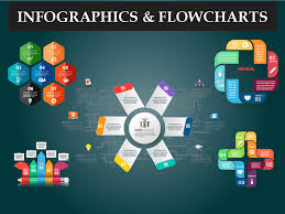
Infographics is a simple yet powerful way to communicate. Information is everywhere. But too much information can be massive. That is where infographics help. They make complex data simple. They turn boring facts into interesting visuals. People love visuals. They process images faster than text.
In this essay, we will explore infographics. We will learn about their history, types, and uses. We will also understand why they work so well.
1. The History of Infographics

Infographics are not new. People have used them for centuries. Early humans used cave paintings. They told stories with pictures. Ancient Egyptians often used hieroglyphs. They shared knowledge with symbols.
In the 1800s, scientists and journalists used infographics for information. Florence Nightingale a famous statistaion used charts to show hospital deaths. Her work led to better healthcare. In the 20th century, newspapers also started using mode of infographics. They made news easier to understand.
Today, infographics are everywhere. They are in books, websites, and social media. They help businesses, teachers, and governments.
2. Why Do Infographics Work?
Infographics combine text and images. This makes information easy to digest. People remember visuals better than words.
Here’s why infographics work:
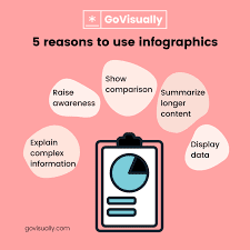
They grab attention quickly.
They simplify complex ideas.
They help people remember information.
They make learning fun.
This is a modern and fast world. Here people don’t have time to read long texts. Infographics save time. That’s why they are so effective.
3. Types of Infographics
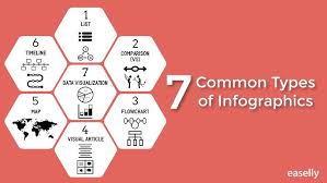
There are many types of infographics. Each type has a different purpose. Here are some common ones:
A. Statistical Infographics
These show numbers and data. They use charts and graphs. Businesses use them to present reports. News agencies use them to show trends.
B. Informational Infographics
These explain a topic step by step. They use simple text and images. Teachers use them to explain lessons. Websites use them to give quick knowledge.
C. Timeline Infographics
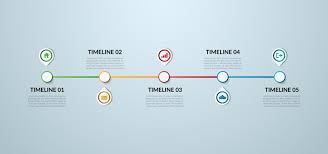
These show events in order. They are useful for history lessons. They help explain how something evolved over time.
D. Process Infographics

These show a process from start to finish. They are used in tutorials. They make learning a process easier.
E. Comparison Infographics
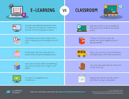
These compare two or more things. They highlight differences and similarities. They help in decision-making.
F. Geographic Infographics

These use maps and locations. They show population, weather, or travel routes. They make geography easy to understand.
G. Hierarchical Infographics

These show ranking and structure. They are used in business and education. They make complex structures simple.
Each type serves a different need. Choosing the right type makes an infographic effective.
4. Where Are Infographics Used?

Infographics are used everywhere. Let’s look at some common areas:
A. Business and Marketing

Companies use infographics to promote products. They show benefits in a simple way. Infographics make advertisements more engaging.
B. Education

Teachers use infographics in classrooms. Students learn better with visuals. It makes studying more fun.
C. Social Media
Infographics are popular on social media. People share them quickly. They spread information fast.
D. Journalism

News websites use infographics. They make news more understandable. They help explain complex stories.
E. Health and Science

Doctors and researchers use infographics. They share medical facts and discoveries. Infographics help people understand health better.
Infographics are useful in every field. They make communication easier.
5. How to Create an Effective Infographic?
Infographic is an art. It must be clear and visually appealing. Here are simple steps to make one:
Step 1: Define Your Purpose
Know why you are making it. What message do you want to share? Keep it simple.
Step 2: Collect Data
Find accurate information. Use reliable sources. Make sure your data is correct.
Step 3: Choose the Right Type
Pick a type that suits your data. Use the right layout.
Step 4: Design It Well
Use colors, fonts, and icons wisely. Keep the design clean. Do not overcrowd it.
Step 5: Make It Easy to Read
Use short text. Keep sentences simple. Let visuals do the talking.
Step 6: Check for Accuracy
Make sure everything is correct. Mistakes reduce trust.
Step 7: Share It
Publish it on websites, social media, or print it. The more people see it, the better.
A well-made infographic is powerful. It spreads information fast.
6. The Future of Infographics

Infographics are evolving. Technology is making them better. Interactive infographics are becoming popular. These allow users to click and explore more details.
Animated infographics are also growing. Videos and GIFs make them more engaging.
Artificial Intelligence is helping designers. It creates data-driven visuals automatically. Infographics will continue to grow in the digital age.
7. The Psychology Behind Infographics

Infographics are not just about looks. They work because of how our brains process information. Human brains love visuals. They recognize patterns faster than words. That’s why infographics grab attention quickly.
A. The Power of Visuals
Studies show that human mind remembers only 80% of seeing. They remember only 20% reading. That’s a great difference. Infographics use colors, shapes, and images. These elements make learning easier.
B. The Role of Colors
Colors create emotions. They make people feel something. For example:
Red shows urgency or excitement.
Blue creates trust and calmness.
Green represents nature and health.
Yellow grabs attention quickly.
Choosing the right colors makes an infographic more effective.
C. The Importance of Simplicity
Too much information confuses people. A good infographic keeps things simple. It highlights key points. It avoids unnecessary details. This makes it easy to understand.
D. The Use of Storytelling
People love stories. Infographics that tell a story are more engaging. They take the reader on a journey. This keeps people interested.
Understanding these psychological factors helps in designing better infographics.
8. Common Mistakes in Infographic Design

Not all infographics are good. Some fail to communicate. Let’s look at common mistakes.
A. Too Much Information
An infographic is not a book. Too much text makes it boring. People won’t read long paragraphs. Keep it short and clear.
B. Poor Color Choices
Using too many colors can be distracting. Some colors don’t mix well. A bad color combination makes an infographic hard to read. Use a limited color palette.
C. Cluttered Design
Too many elements create chaos. White space is important. It makes the design clean and easy to read.
D. Low-Quality Images
Blurry or pixelated images look unprofessional. Always use high-quality visuals.
E. Lack of Hierarchy
Not all information is equally important. Use different font sizes and colors to highlight key points.
Avoiding these mistakes improves the impact of an infographic.
9. Tools for Creating Infographics

Many tools make the process easy. Here are some popular ones:
A. Canva

Canva is beginner-friendly. It has templates and drag-and-drop features. It’s great for quick designs.
B. Piktochart

Piktochart is perfect for business and marketing. It offers data visualization tools.
C. Venngage

Venngage is great for professional-looking infographics. It’s used by businesses and educators.
D. Adobe Illustrator

Illustrator is for advanced designers. It offers full creative control. But it has a learning curve.
E. Visme

Visme combines infographic design with presentation tools. It’s good for business reports.
These tools help anyone create high quality infographics.
10. Infographics in Digital Marketing
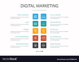
Marketing is all about communication and collection. Infographics help businesses connect with people.
A. Boosting Engagement

People share infographics more than plain text. A good infographic can go viral. It increases brand awareness.
B. Improving SEO

Google loves visuals. Infographics improve website rankings. They attract backlinks, which help in SEO.
C. Increasing Conversion Rates

A clear infographic can convince customers. It explains a product or service quickly. This leads to more sales.
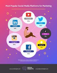
D. Social Media Impact

Different platforms favour visual content. Some are Instagram, Pinterest, and LinkedIn. Infographics perform well on these platforms.
That’s why digital marketers rely on infographics. They make campaigns more effective.
11. The Evolution of Infographics

Infographics have changed over time. They have adapted to new technologies.
A. From Static to Interactive
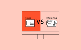
Old infographics were just images. Now, they are interactive. Users can click and explore more information.
B. Animated Infographics
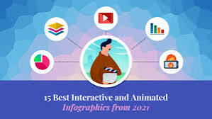
GIFs and video infographics are gaining popularity. They keep people engaged longer.
C. AI-Powered Infographics

Artificial intelligence is making infographics smarter. AI can generate visuals based on data. This saves time and effort.
Infographics will continue to evolve. They will become more dynamic and engaging.
12. Case Studies: Successful Infographics

Let’s look at real examples of infographics that made an impact.
A. The “Flat Earth” Myth Infographic

A science website created an infographic debunking the flat earth theory. It simplified complex science. It went viral and educated millions.
B. COVID-19 Safety Infographics

During the pandemic, health organizations used infographics. They explained safety measures. This helped save lives.
C. Company Growth Reports
Many companies use infographics to show success. A well-designed growth infographic can attract investors.
These examples show how infographics can influence people.
Conclusion

Infographics are a powerful tool. They make information easy to understand. They combine visuals and text in a simple way.
They are used in marketing, education, and news. They boost engagement and improve communication.
Good infographics follow design principles. They use colors, space, and storytelling effectively. Avoiding common mistakes makes them more impactful.
The future of infographics is exciting. With AI and animation, they will become even more powerful. They will continue to shape the way we share information.
Infographics turn data into stories. And stories stay with us.
____________________________